Needing inspiration i happened to stumble across logobird.com :
Its got some really interesting tips and a great portfolio of work of which i have shown some of my faves below :

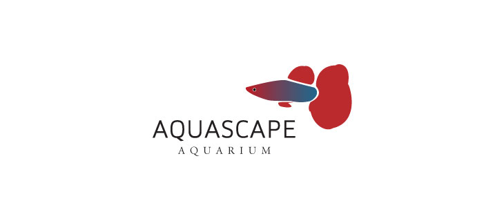
With this logo , im not pushed on the positioning of the image : although i do like it , the colouring and the soft lines : The type however is lovely , i think it works incredibly well , i like to use softer thiner fonts , i also like to type alot in capitals Shouts Statement i think !

365 To me is a prime example of well used type : the bold approach to this logo concept is correct i believe : I think that a thiner type may not have worked well and with the 4 simple blocks of color i think this logo is effortlessly simple and easy on the eye !

Were Aquascape failed on the postitioning of its image ( in my opinion anyway ) windmill web has came out tops ! Mite be something personal , i just feel it looks more comfortable on this side : The type i feel is nice , it sits well and the diff between the bold and normal is nice , a really nice brand
No comments:
Post a Comment